Now that we can render and animate hexagons, can we tilt them?
 |
| Spoiler: yes |
Directly in the rendering logic, this is tricky. I'll have to add a rotation to the canvas (easy) and then find the height and width of a rectangle overlapping the canvas at which tesselation occurs so I can tile the background (much less easy). Fortunately, CSS transforms can make this much easier—not perfectly easy, but not bad.
The big challenge doing something like this with CSS is that CSS conflates rendering logic and layout logic: every object visible on the page is a DOM element, and every DOM element impacts the page layout. In an ideal world, I could just set a rendering rule for the background and let layout operate separately (the element background-image type supported by Firefox gets close to allowing this). Instead, the approach is a bit more complex:
- Leave the background of
bodyunchanged - As children of
body, have twodivs: one to serve as background container, one to hold content - The
background-containerdiv addresses the layout concern: it is set to fill 100% of the window and usesoverflow: clipto clip off any excess content that tries to overflow the window - As child of
background-container, abackgrounddiv is set larger than the window, is set to repeat its image, has the rotation applied, and has az-indexset to be behind other content - The
contentdiv is set to also take up the whole window and has az-indexset to be in front of the background.
Without the background-container, the background forces the layout algorithm to try and fit the entire tilted element, which introduces unwanted scrolling.
It's not the prettiest CSS but it gets the job done.
.background-container {
    position: absolute;
    left: 0px;
    top: 0px;
    right: 0px;
    bottom: 0px;
    overflow: clip;
}
#background {
    position: absolute;
    left: -100%;
    top: -100%;
    right: -100%;
    bottom: -100%;
    background-repeat: repeat;
    transform: rotate(-20deg);
    z-index: 0;
}

.content {
    position: absolute;
    left: 0px;
    top: 0px;
    right: 0px;
    bottom: 0px;
    z-index: 1;
}
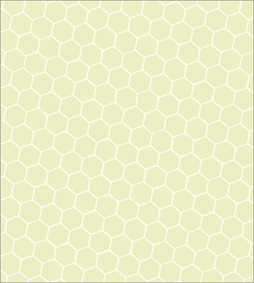
And the result is pretty satisfying!
No comments:
Post a Comment